helium
comedy club
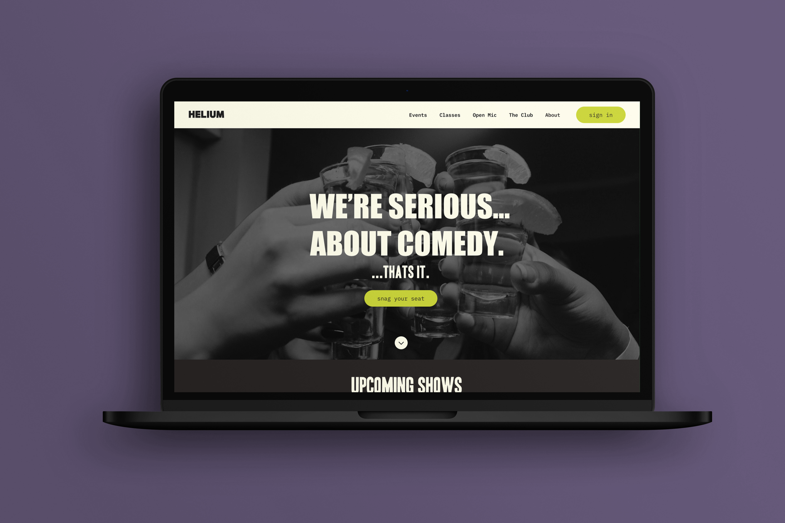
WELCOME TO HELIUM
A reimagined website rooted in comedy, energy, and late-night culture. This refresh brings Helium into the now: loud, sharp, and unapologetically electric. From type to tone, color to interface, every decision aims to elevate the experience without losing the punchline.
01
navigation
02
usability
03
visual hierarchy
04
branding
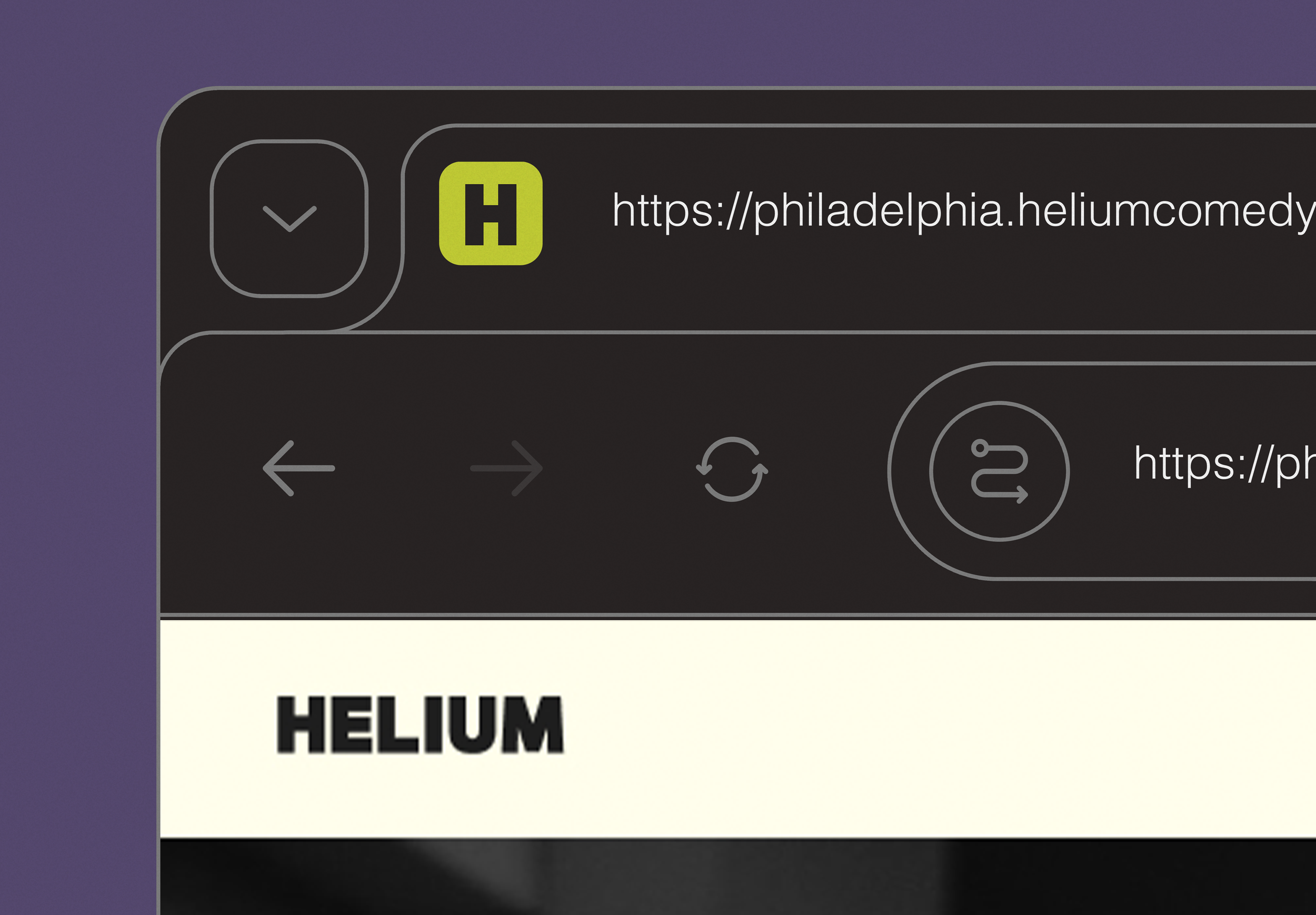
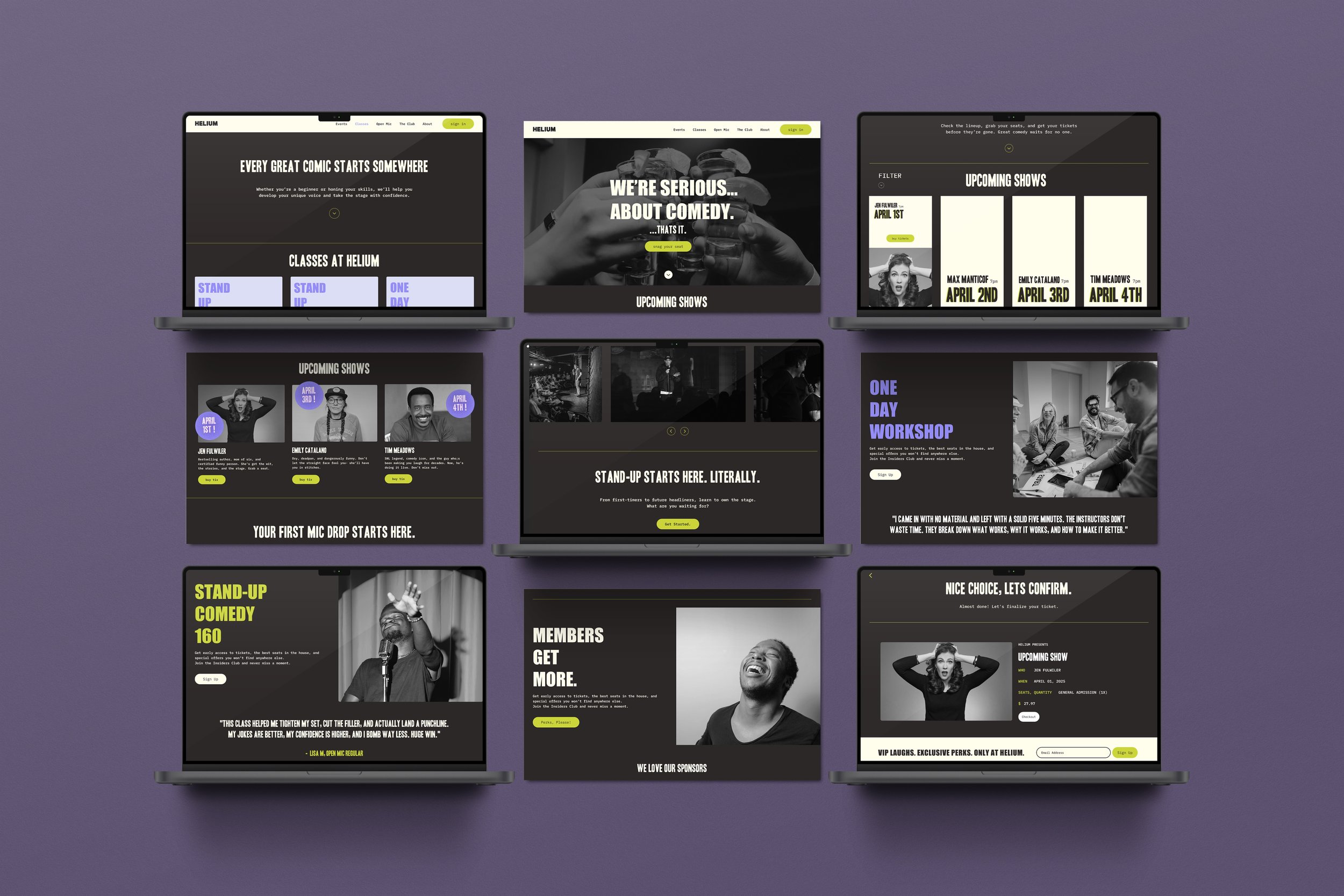
THE INTERFACE
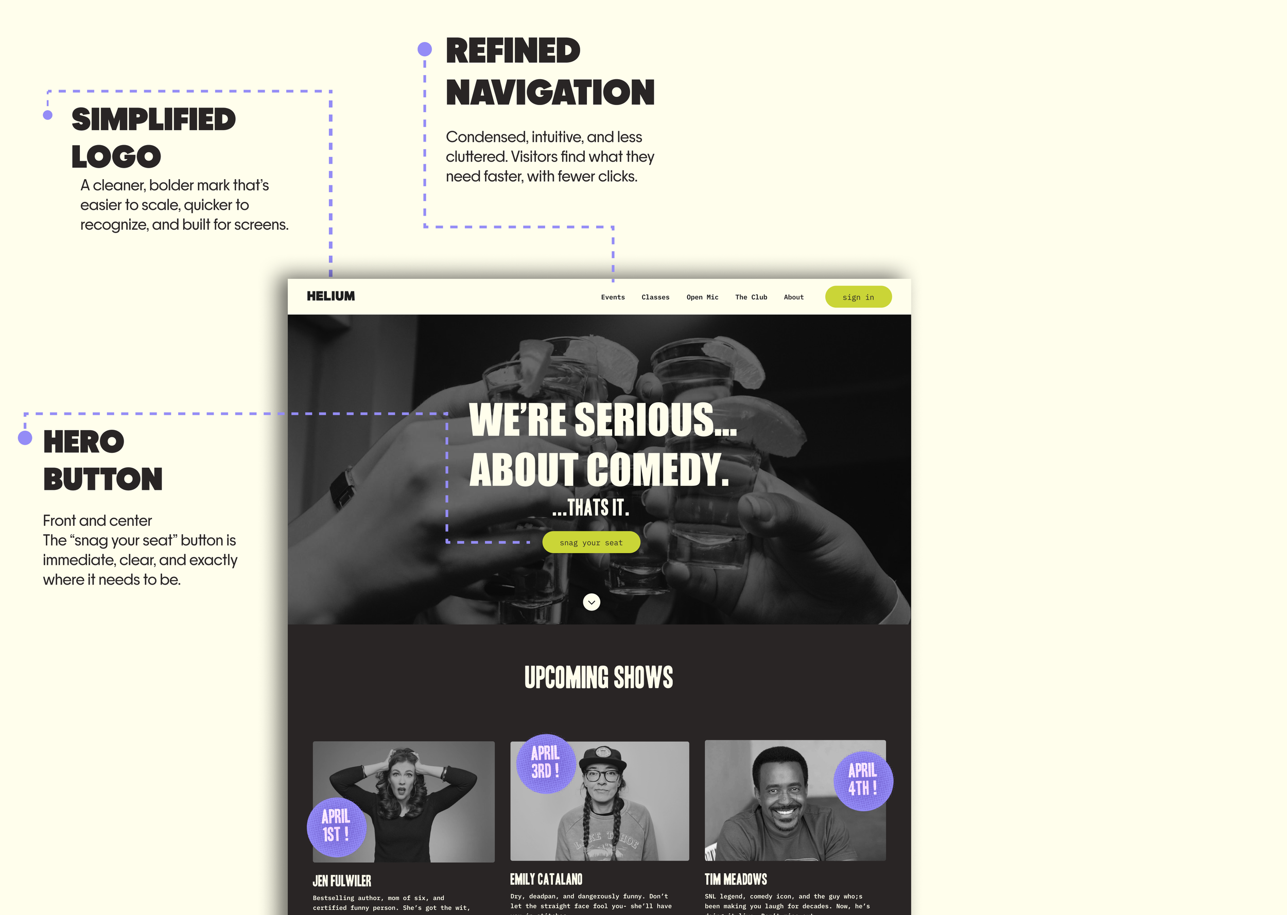
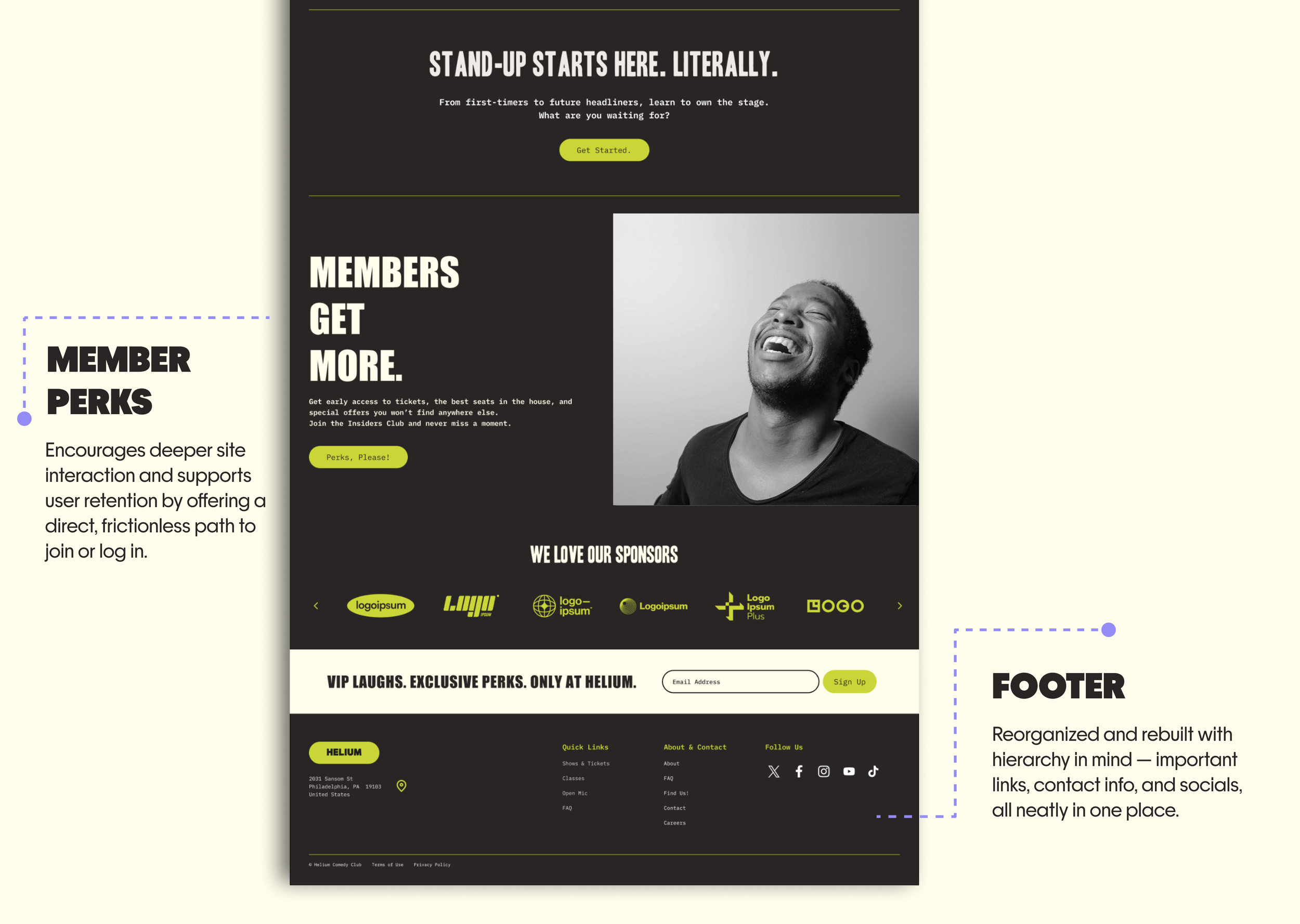
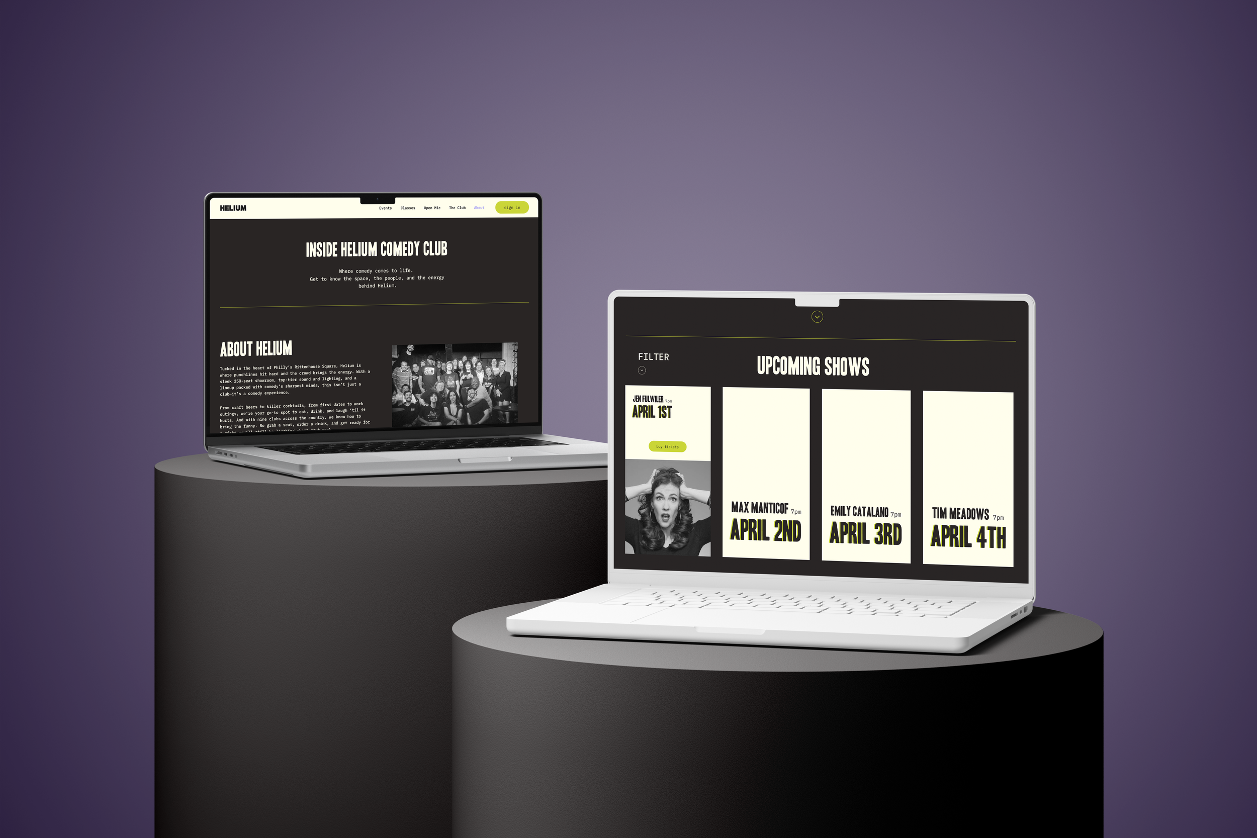
This interface is designed to meet users where they are.
No guesswork, no clutter, just clear pathways and intuitive hierarchy that prioritize action and ease.
“Rebranding helium was not about starting over. It was about building upon what already worked and pushing it further”.
THE LOGO
Both versions use a bold sans, what sets the improved wordmark apart?
The previous wordmark felt clunky and uneven, with too little contrast between the lines.

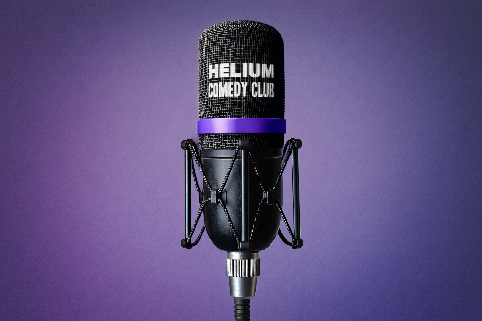
The new typeface brings clarity and intention. Bold, wide-set letterforms in “HELIUM” ground the brand with confidence, while the narrower “COMEDY CLUB” adds rhythm and contrast.